>
> Sign In
Templates
The Html that composes all parts of Data Moving Controls is created by instantiating customizable templates. Data Moving-Plug-in templates enhance Mvc Controls Toolkit templates. Mvc Controls Toolkit templates are essentially either strongly typed Partial Views or Razor helpers/normal functions with a strongly typed HtmlHelper as their single parameter. In both cases they use a strongly typed HtmlHelper to render a server side or a client side data structure. Client Controls templates are compiled into knockout.js client templates, since they must render javascript data. All HtmlHelper<T>-only based templates are called simple templates.
The Data Moving Plug-in supports also complex templates, that is, templates that accepts also other parameters after the HtmlHelper<T> parameter. This way, the mark-up produced by each template may depend also on the options specified by the developer with the control fluent interface that are passed to the template together with the HtmlHelper<T> instance. Whenever the developer provides a custom template he may choose between simple and complex templates.
All mark-up produced by all Data Moving Plug-in controls is not hardwired but it is based on default templates that may be changed by the developer. More specifically, all controls have an overall template that defines the basic structure of the control, so that changing this template may turn the control into a completely different control.
Items controls have also row templates and column templates. Different row templates are used for toolbars, headers, footers, etc, and all of them may be substituted with custom templates in several ways. There are three types of default row templates that come with the Data Moving Plug-in: <tr><td>…based templates to be used for tabular data, <div style=’display: table-row’…>… based template to be used when we need a table-like appearance but data are not tabular, and float based row templates. All default row templates put together the markup returned by all column templates, but custom row template, may also avoid the use of column templates.
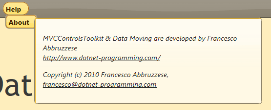
Below a Menu item with a custom row template:
and the code that creates it:
.AddRowType().CustomRowTemplateFixed(TemplateType.Display,
@<div class="about-info ui-state-highlight">
<p>
MVCControlsToolkit &
Data Moving are developed by Francesco Abbruzzese
<br />
@item.LinkFor(m => m.Text, m => m.Text,
new { target=item.ViewData.Model.Target, tabindex="0"})
</p>
<p>
Copyright (c) 2010 Francesco Abbruzzese,
<br />
<a tabindex='0'
href="mailto:[email protected]">
[email protected]</a>
</p>
</div>).EndRowType();
The Data Moving Plug-in comes with default templates for different column types:
- Standard columns. Their default template may be controlled with a fluent interface. They are able to render properly any .Net data type both in edit and in display mode. We may choose to use the Asp.net Mvc Display and Edit templates defined for the given types, or Display only, and TypedTextBoxes based templates that are automatically optimized for each data type. It is also possible to specify the use of the new Html5 inputs; the selection of the right Html5 input type is done automatically according to the column data type and to a possible DataType attribute that may decorate the property associated with the column.
- Image columns. They extracts both the src and the alt of the image from the item data;
- Link columns capable of extracting the href, the link text, and other Html attributes from the item data. They may be used also for virtual links that load views in a Single Page Application.
- Text Columns, to render constant text or constant Html.
- Button Columns, to render single buttons or buttons organized in bars.
- Pager Columns, to display a pager.
- RowCount columns, to count rows
- Error Column, to display errors associated to the whole row.
The fluent interface for specifying the appearance and properties of rows and columns is exactly the same for all items control.