>
> Sign In
Buttons & Buttons Toolbars
Button operations are handled automatically by all Data Moving-Plug-in Controls. The developer may render the usual Buttons contained in controls toolbars also out of any Control by providing custom click handlers that intercept button clicks and interpret the commands contained in their data-operation attribute.
Buttons may be separated:
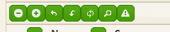
or organized into ButtonBars:
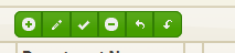
All button features are defined with a fluent interface. Below an example:
<div class="header-toolbar ui-widget-header EVMSPlot-toolbarButtons">
@{var buttons = Html.Buttons(CommandButtonType.Custom, "operation-back")
.OverrideDefaultIcon("ui-icon-arrowthick-1-w")
.Scale(CommandButtonScale.Large)
.AppendButton(CommandButtonType.Custom, "operation-zoomout")
.OverrideDefaultIcon("ui-icon-zoomout")
.Scale(CommandButtonScale.Large);
}
@buttons.Render()
</div>